
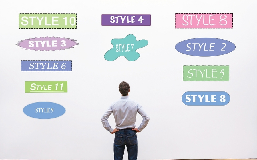
Is your brand looking messy, inconsistent on media channels where every publication is different? If the answer is yes, it’s a clear sign that your business is lacking a professional branding code, and it’s time to find out. how to make brand guidelines in a formal way.
This article is not just a theory but a detailed step-by-step process that the team of experts at Duandigi has applied, to successfully build a brand code for hundreds of customers before.
We will share with you exactly the process we have applied to build brand guidelines for our partners. This is not a theory, but a practical roadmap from defining the brand “soul” to the most specific regulations visually.
What are Brand Guidelines?
Brand Guidelines (Brand Regulation) A comprehensive guide to how your brand is presented. The content includes the use of logos, color schemes, typography, images, messages and other identifying elements. The goal is to ensure consistency in the image transmission, while strengthening the brand’s ability to identify in the eyes of customers and partners.
Importance of Brand Guidelines
💡 Brand identity is only really valuable when tied to strategy. See how to build marketing for small and medium enterprises to brand guidelines that serve the right business goals.
- Helps to keep the image and brand message consistent across all media platforms.
- Save time and cost of design and communication thanks to clear standards.
- Increase brand awareness and connect closely with customers.

Core components of a professional set of brand guidelines
1. Brand Foundation
Before you think about colors or logos, you have to answer the question: “Who is my brand?” This part is the guide for any creative decisions later on.
Imagine you’re building a sustainable coffee brand called “Green Coffee Sprouts”. Your platform will be as follows:
- Mission: “Bring quality organic coffee, contributing to supporting Vietnamese farmers and protecting the environment.”
- Vision (Vision): “Become the most popular coffee chain for conscious living people.”
- Core Values: Sustainability – Community – Quality.
Our experience: Many people often skip this part. But this is a serious mistake. It is these core values that will guide the visual part.
For example, with value “Sustainable” of Coffee Green Sprouts, your color palette should give preference to earthy tones, green. The visual style will be natural light, rustic materials instead of plastic and cold metal.
2. Logo – The Heart of the Brand
This is the most obvious factor, but it’s also the most easily misused.
- Usage versions (Logo Variations): Our experience is that you have to provide a full version. For example, your full logo will be beautiful on the website, but when making Facebook avatars or seals on coffee cups, you should only use the icon (icon) so that it is not small and difficult to read.
- Safety Zone (Clear Space): Imagine the safety zone as a personal “breathing space.” You won’t want anyone standing too close to you, and neither will your logo. It needs space to stand out and not be pinned down by other elements.
- Mistakes to avoid (Logo Misuse): This is the part that should be done. We’ve seen logos that are stretched out looking unprofessional, or that are placed on a flowery background that makes it impossible for the viewer to recognize the brand. You have to list these errors and say, “Absolutely not.”

3. Color Palette – Emotional Language
Color consistency will create an extremely strong brand identity. With the example “Green Coffee Sprouts”, the color palette can be:
- Primary Colors: The Earth Brown (#6B4F4F) symbolizes coffee and the mother soil, and the Moss Green (#A4BE7B) represents sustainability.
- Secondary Colors: Beige (#FFF4E0) for background and Fire Orange (#E49357) for call-to-action buttons.
- Detailed Color Parameters: We have encountered cases where customers print business cards that are blue different from blue on the website, just because the printing designer does not have the correct color code CMYK. To avoid this error, you must provide sufficient: HEX/RGB (for display) and CMYK/Pantone (for printing).
4. Typography System
The way you present your words also reflects your brand’s personality.
- Hierarchy (Hierarchy) rules: Think of this system as an article: the main title is always the biggest and most prominent, the subtitles are smaller, and the content is easy to read. We always make clear rules, for example:
- Title H1: Playfair Display, Bold, 36pt.
- H2 Header: Playfair Display, Regular, 24pt.
- Text Paragraph: Montserrat, Regular, 16pt. Compliance with this rule keeps readers from “overflowing” with words and makes every word of your text look professional.
5. Imagery Style
The images you use say a lot about the brand. We often create a “Shoulds and Don’ts” section with visual examples. With “Green Coffee Sprouts”:
- Should: Natural light, coffee beans, farmers, or customers smiling enjoying coffee in a rustic, cozy space.
- Should not: Use fake stock photos, images that use harsh flashes, or messy, cluttered spaces.
6. Icon & Illustration
Our experience is not to use icons from multiple sets, which look like a “pizza bowl”. Be clear.
- For example: “All icons must be in line icon, Brown (#6B4F4F), rounded at the corners and 2pt thickness.”
7. Brand Voice (Tone of Voice)
💡 Brand voices are only standard when you know who you’re talking to. In combination with Target customer portrait and… Free promotion channels to spread the message to the right people.
This section defines how your brand “chats” with customers. With “Green Coffee Sprouts”, personality is: Sincere, Close, Conscious.
- Regulations on how to communicate:
- Should say: “Our coffee was hand – picked by the farmers in Lam Dong, man.”
- Do not say: “Our coffee is harvested in a standardized process in the raw material area.”
Guidelines on how to make brand guidelines

1. Choose the right format
First of all, you need to define the format of the Brand Guidelines for easy storage and sharing. Usually, we recommend using PDF files or online guidelines. For multi-channel businesses, you can combine both printed and online versions for convenience.
2. Identify the core elements
A set of Brand Guidelines not only talks about the image but also tells the brand story. With Duan Digi, you will build:
- Brand storyVision, mission, core values, history.
- Brand Message: tone, tagline, value bring.
- Image Elements: logo, color palette, font, image, icon, web design, video …
- Principle of use: how to put logo, valid colors, things not to do.
- Other factors: like sound or scent if your brand has.
3. Drafting detailed Brand Guidelines
At this step, we will work with you to make clear rules for each element, for example:
- Logo: minimum size, safety distance, color version.
- Color palette: main color code – secondary color, priority order.
- Fonts: usage for title, content, quotation.
- Photo Gallery: style, example illustration, handling.
- Message Template: transmission way on different channels.
The goal is to have a set of standards that are both specific and easy to apply, avoiding any deviations when implementing.
4. Ensure easy access and sharing
We recommend hosting Brand Guidelines on a cloud platform, shared server, or an internal site so everyone – from staff, departments, to partners – can easily access it.
5. Stay up to date
Brand Guidelines are not immutable documents. We recommend that you review and adjust at least every year, or when brands have changed, to stay relevant and modern.
Some tips from Digi Travel
- If you are n’t confident, you can ask a professional to help you build your relationship.
- Give your theme colors a specific name to help you remember them.
- Always state what should and should not be done with each element.
- Present details, with visual illustrations.
- If you start from scratch, prioritize building your brand story and the basics first, then getting into the details.
3 Examples of Brand Guidelines
That’s the theory, but the best way to understand the power of brand guidelines is to see how the giants did it. We analyzed 3 classic examples, each with a valuable lesson you can apply.

1. Spotify: The Power of the Unique Visual System
- Lesson: When we mention Spotify, we and maybe you will think of Duotone images (two tones) full of art and distinctive green. Spotify has created an extremely smart identification system. By applying Duotone filters to any artist image, they made the inconsistent photos part of the Spotify brand.
- What can you learn? Think about whether you can create a unique visual “mark.” It could be a custom color scheme, a pattern, or a unique layout.
2. Netflix: Minimalism Makes Power
- Lesson: Netflix is the master of minimalism. Their brand guidelines are extremely tight: the red “NETFLIX” logo on a black or white background, and the stretchy “N” icon. With just three colors Red – Black – White, they have created a strong, classy identification and immediately evoke us a sense of cinema.
- What can you learn? Sometimes, less is more. A set of standards doesn’t have to be complicated. Consistent compliance with a few core elements (logo, 1-2 colors) can produce greater efficiency than a complex system.
3. Uber: Building a flexible system to grow
- Lesson: Uber operates globally with a variety of services (Uber Ride, Uber Eats…). So, their brand guidelines are not rigid rules, but a flexible system. We were impressed with how they built their own set of fonts (Uber Move) that work well in multiple languages and a simple, easy-to-understand icon library around the world.
- What can you learn? When you’re building brand guidelines, think about the future. Will your brand expand its product or market? Create a system that is consistent enough to identify, but flexible enough to grow.
Summary
💡 Want a set of brand guidelines and a synchronized marketing system from the beginning? Discover Duandigi’s services to build a solid brand foundation.
Brand Guidelines are not a constrained document that binds creativity. On the contrary, they are a powerful tool for building consistency and professionalism, saving your team time and money and creating consistent, brand-spirited products together in the long run.
Sincere advice from Duandigi: “Treat this set of guidelines as a living asset of your brand, ready to update and grow with your business. Don’t let it ‘dust away’ in a folder on your computer.”